The Yas Marina Circuit Scope
Context:
Onboard YMC (Abu Dhabi Grand Prix) onto the YAS connect platform in order to leverage business drivers around Revenue Growth, Operational Effectiveness, Innovation and Digital Experience. The platform would come with a range of advantages such as a single sign on system for all tenants on Yas Island as well as expanded wifi network coverage to increase customer data which is then shared across tenant entities. However by on-boarding onto the platform we had to make use of the existing inventory of puzzle-piece components from other tenants in order to build the new experience.
My Role:
User Experience Design (UX and UI)
Visual Design
The year:
2019
UX Discovery
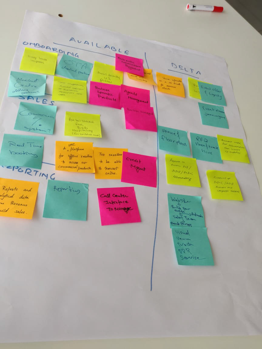
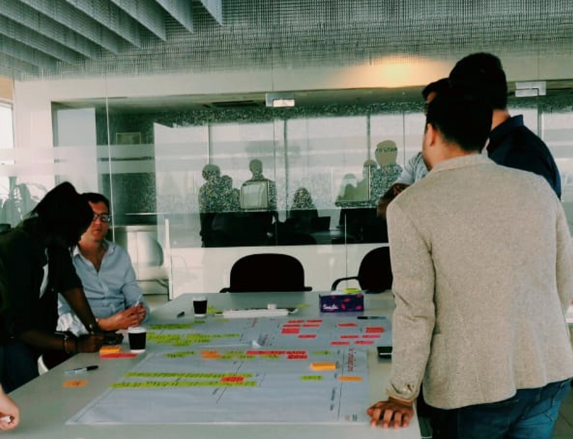
Once we understood the scope and the platform restrictions we started the task of UX discovery.
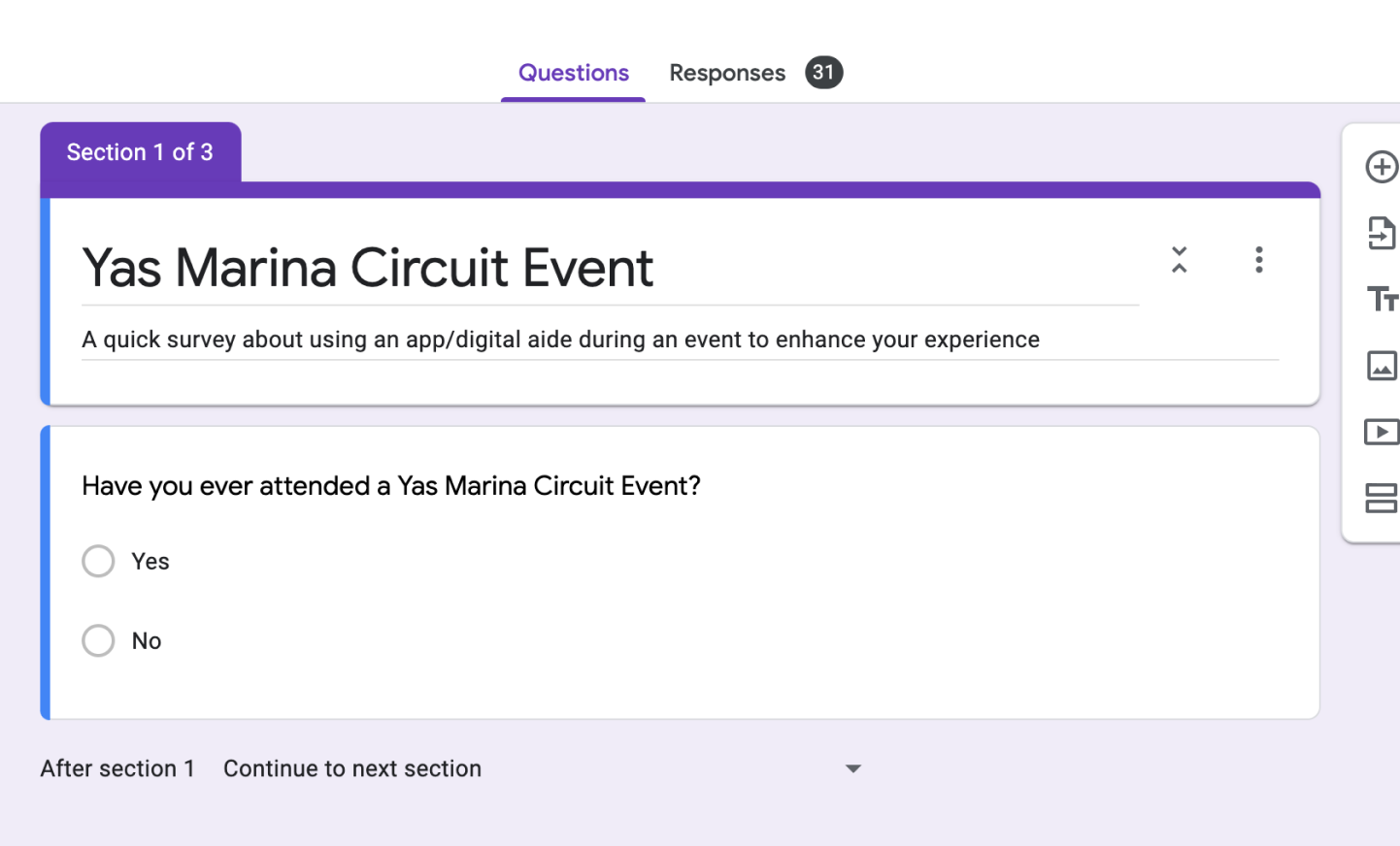
We used various tools to collect insights on what people thought of the brand and its digital assets. From Usertesting.com, google surveys and an in-depth Human Centred Design Canvas workshop we gathered thoughts from both the Brand itself as well as their audience. We also did an intensive benchmarking and landscape analysis exercise to understand where the market was at in terms of online ticketing and entertainment entities.
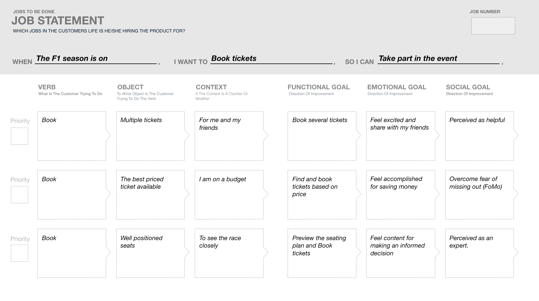
After extensive persona development we along with the stakeholders came up with the better and more suited Jobs to be done framework which was applied to the project in order to design for certain tasks the user wanted to complete.
We analysed how YMC was visually presenting itself to the world from their social media channels to the existing website design. There was alot of inconsistency in terms of fonts and colours that we would not be able to solve but we could at least try to manage the design of the website and application. However a lot of artwork provided from third parties and the in house design team that would not be consistent with the brand and this was something we had to accept and design for.

The Problems & Challenges
The Brand
Disconnected brand imagery/style
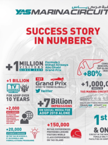
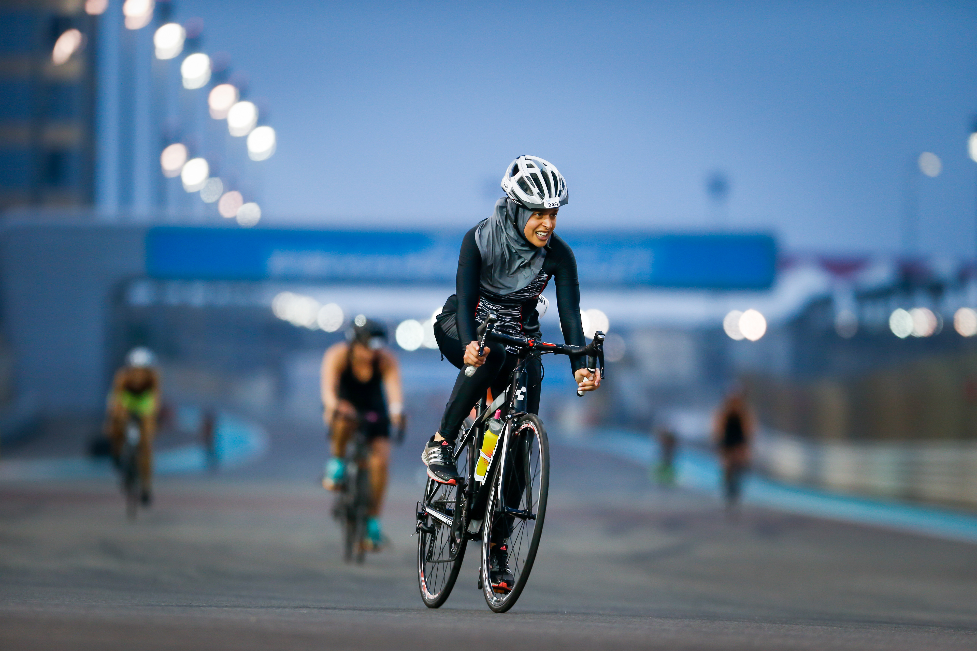
Unclear offerings - People mainly consider YMC to be only motorsports and are not clear on the plethora of offerings from B2B corporate venue hire to entertainment and health and fitness events.
Unclear offerings - People mainly consider YMC to be only motorsports and are not clear on the plethora of offerings from B2B corporate venue hire to entertainment and health and fitness events.
The Website & App
Lack of Personalisation
Lack of Cross Selling or up selling especially of other Yas Island Entities
Currently Mobile and web offer very different experiences
Limited information for B2B services
Not 100% Responsive
Broken Links
Inconsistent visual design
Lack of Cross Selling or up selling especially of other Yas Island Entities
Currently Mobile and web offer very different experiences
Limited information for B2B services
Not 100% Responsive
Broken Links
Inconsistent visual design
The Project Challenges
Limited component library and limited scope. Tech First approach and not experience first approach.
Tight deadline to get ready for Go Live for the F1 2019
Mid-Project change in team structure - UX lead changed
Tight deadline to get ready for Go Live for the F1 2019
Mid-Project change in team structure - UX lead changed
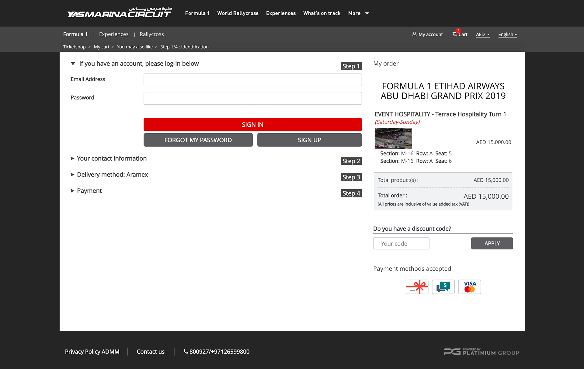
Wireframes
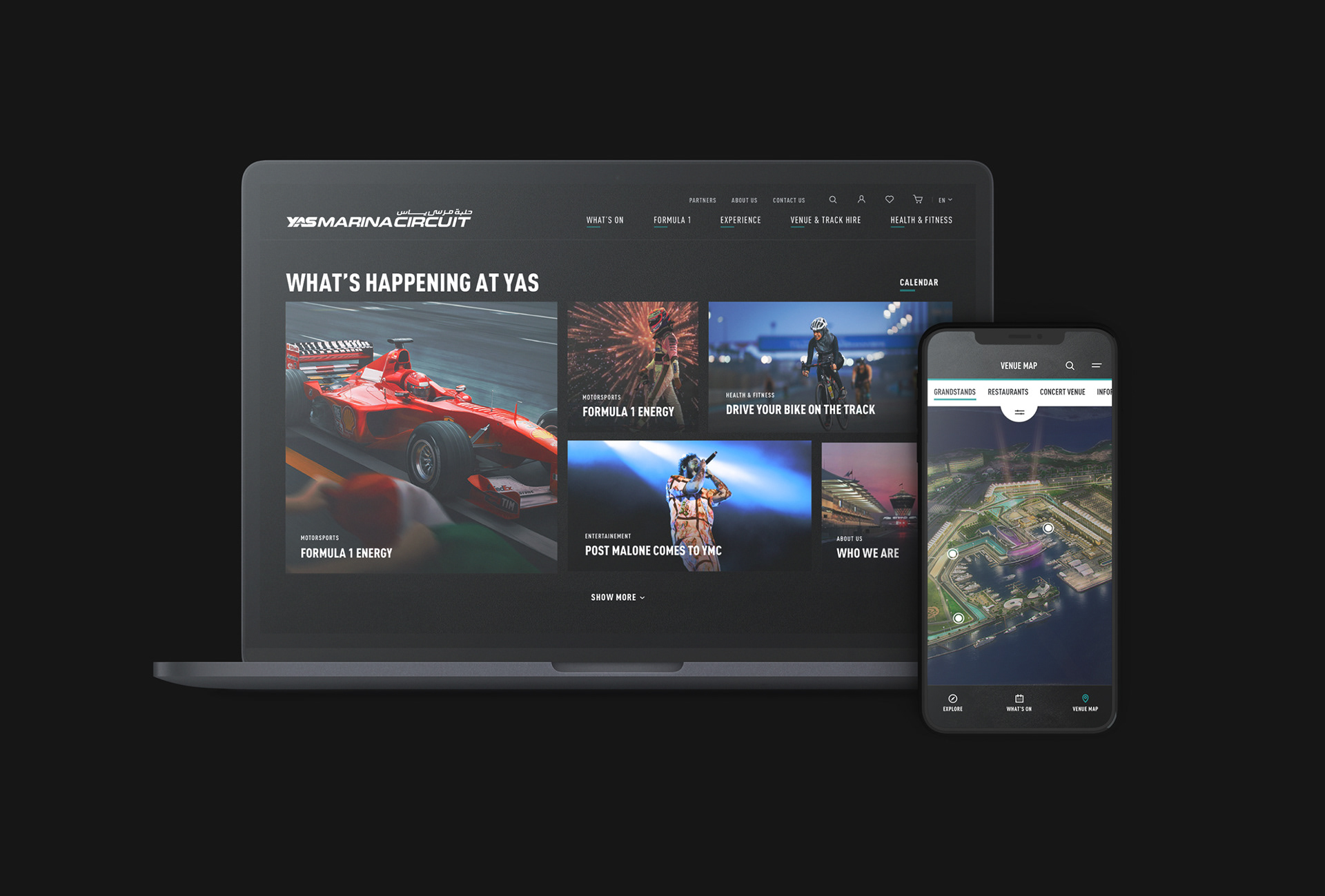
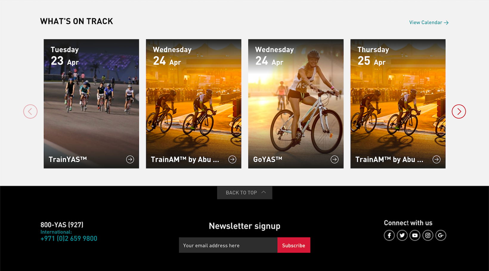
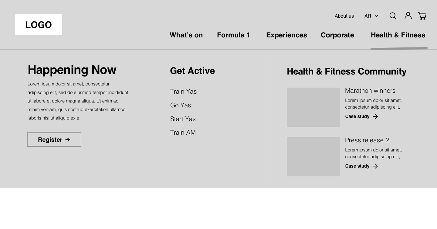
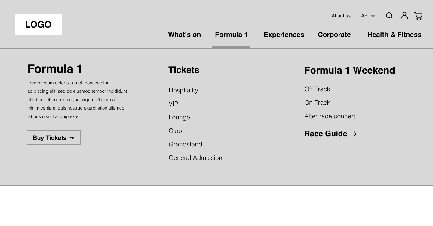
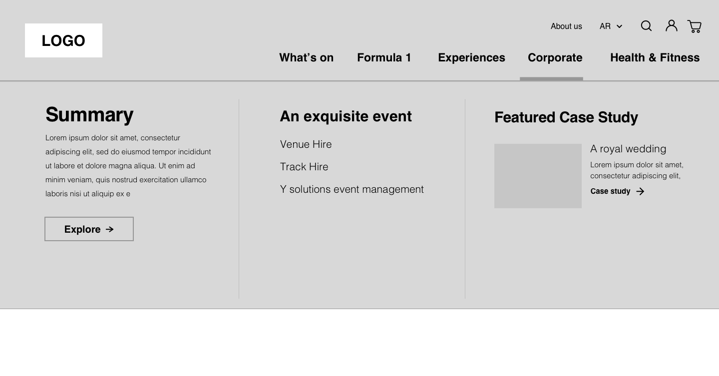
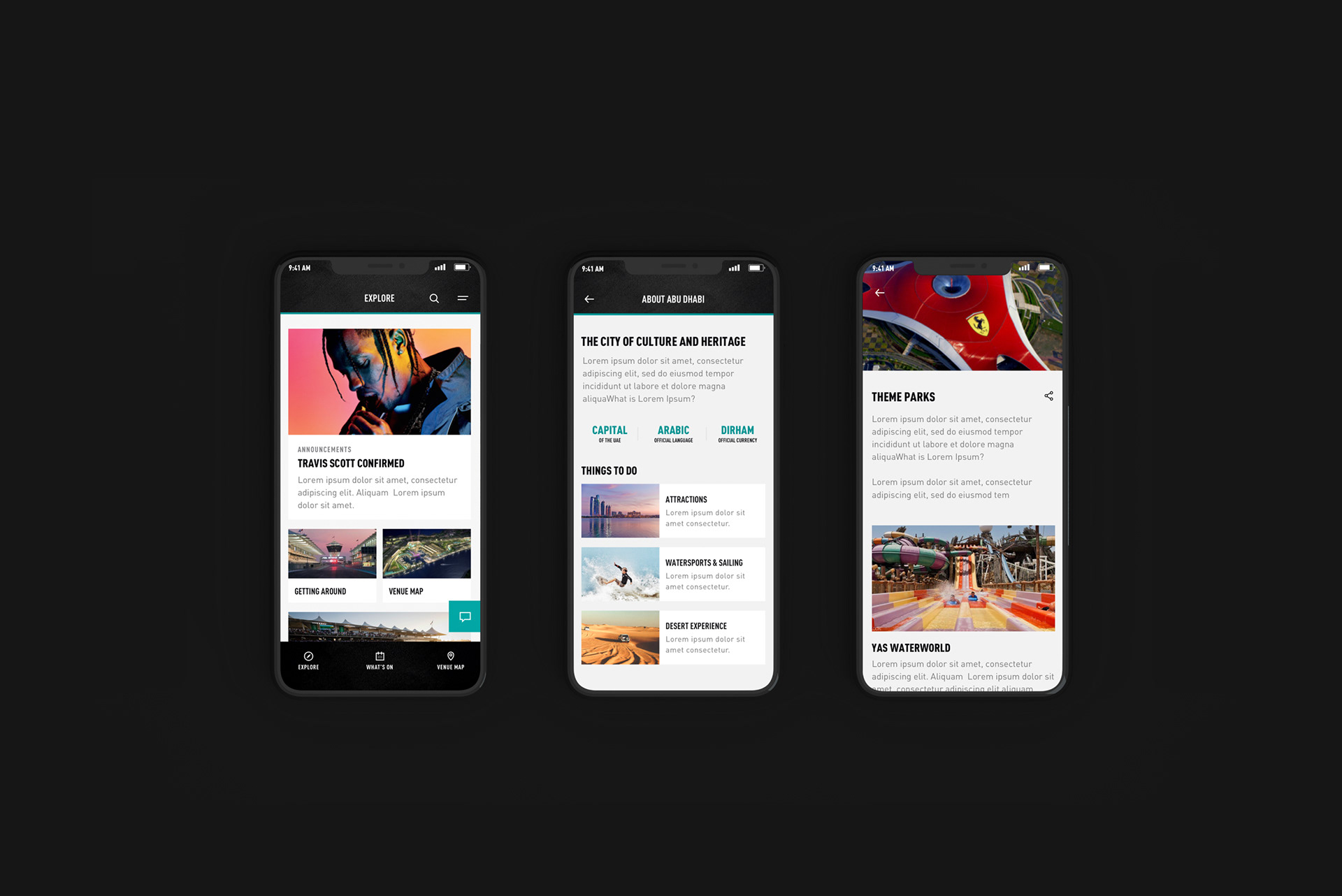
In order to break that stereotype of YMC being only an F1 venue, we decided to use a grid component on the homepage to showcase all of YMC offerings such as Health and fitness events, corporate venue hire and motorsports experiences. By doing so, we encouraged the "Whats on at YMC" attitude where we would hope to see people use YMC as their go-to-calendar and grid component as a regular source of what's going at YMC.
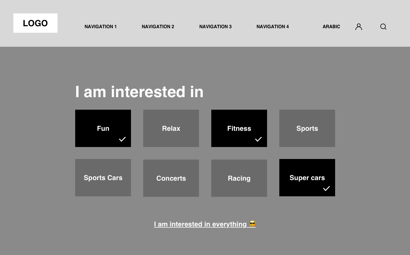
We also created an on-boarding personalisation screen where users could select what interests them most so that content would be filtered according to preference.
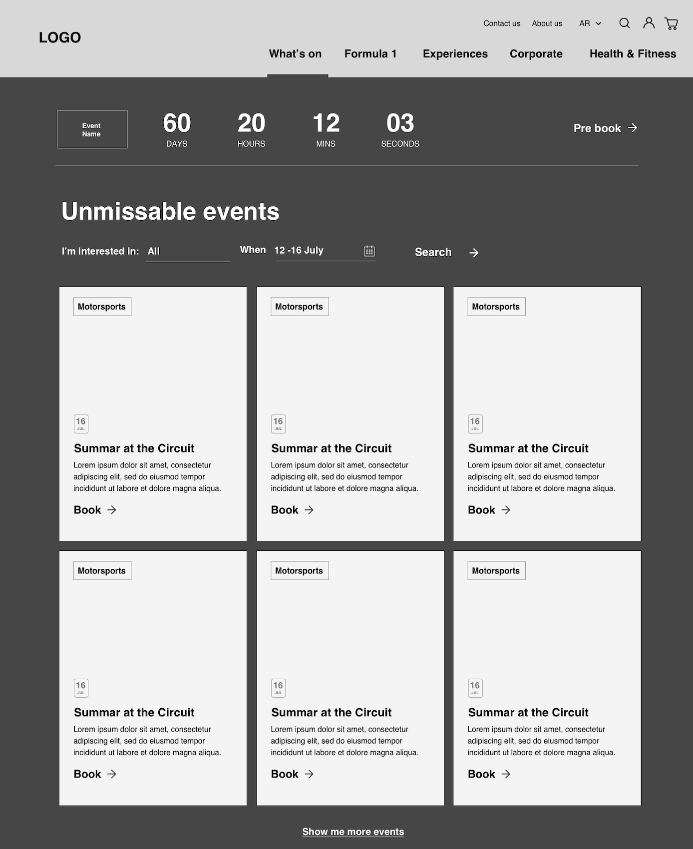
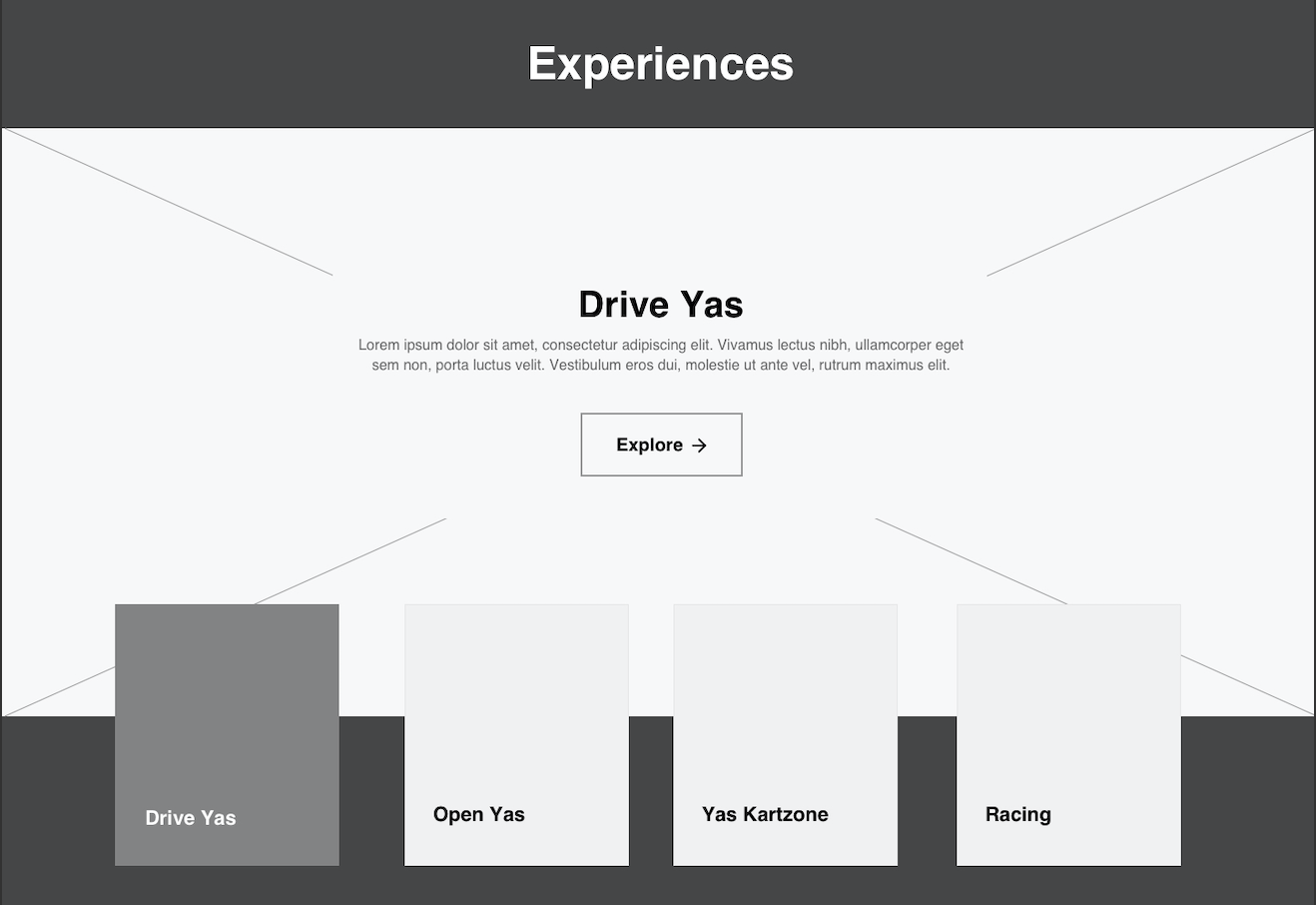
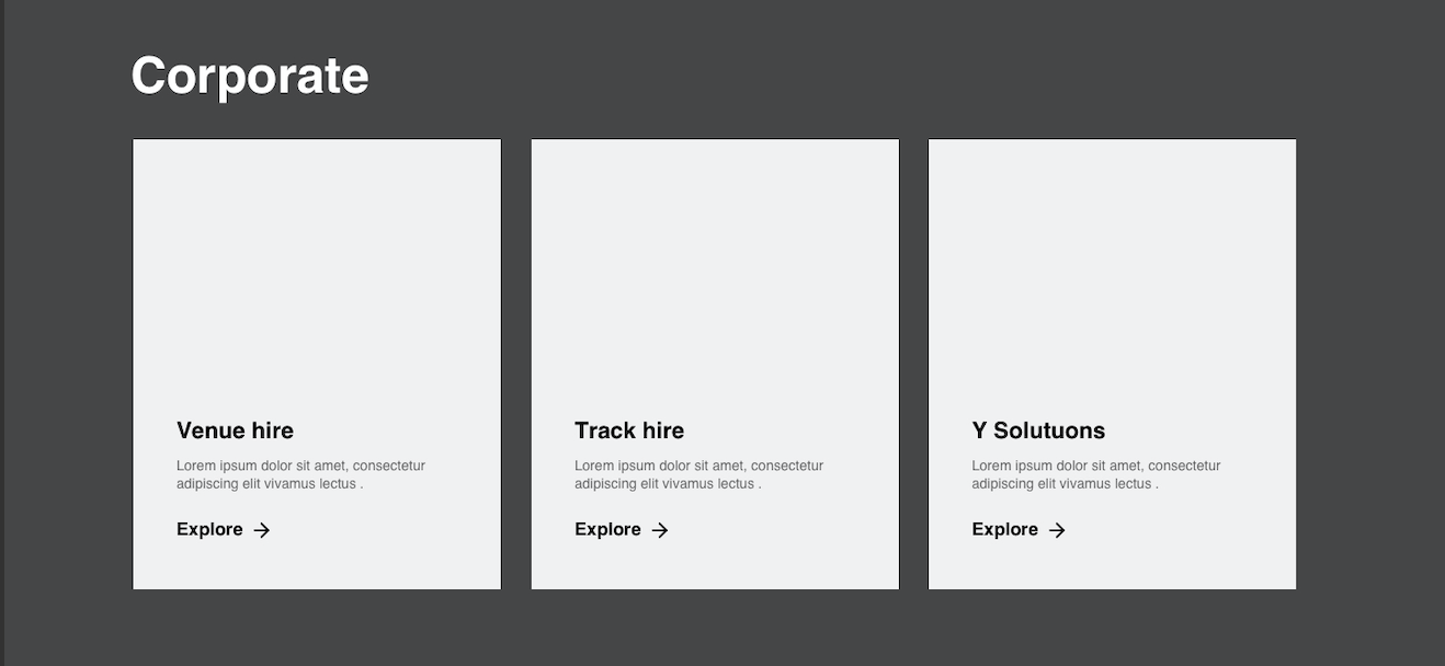
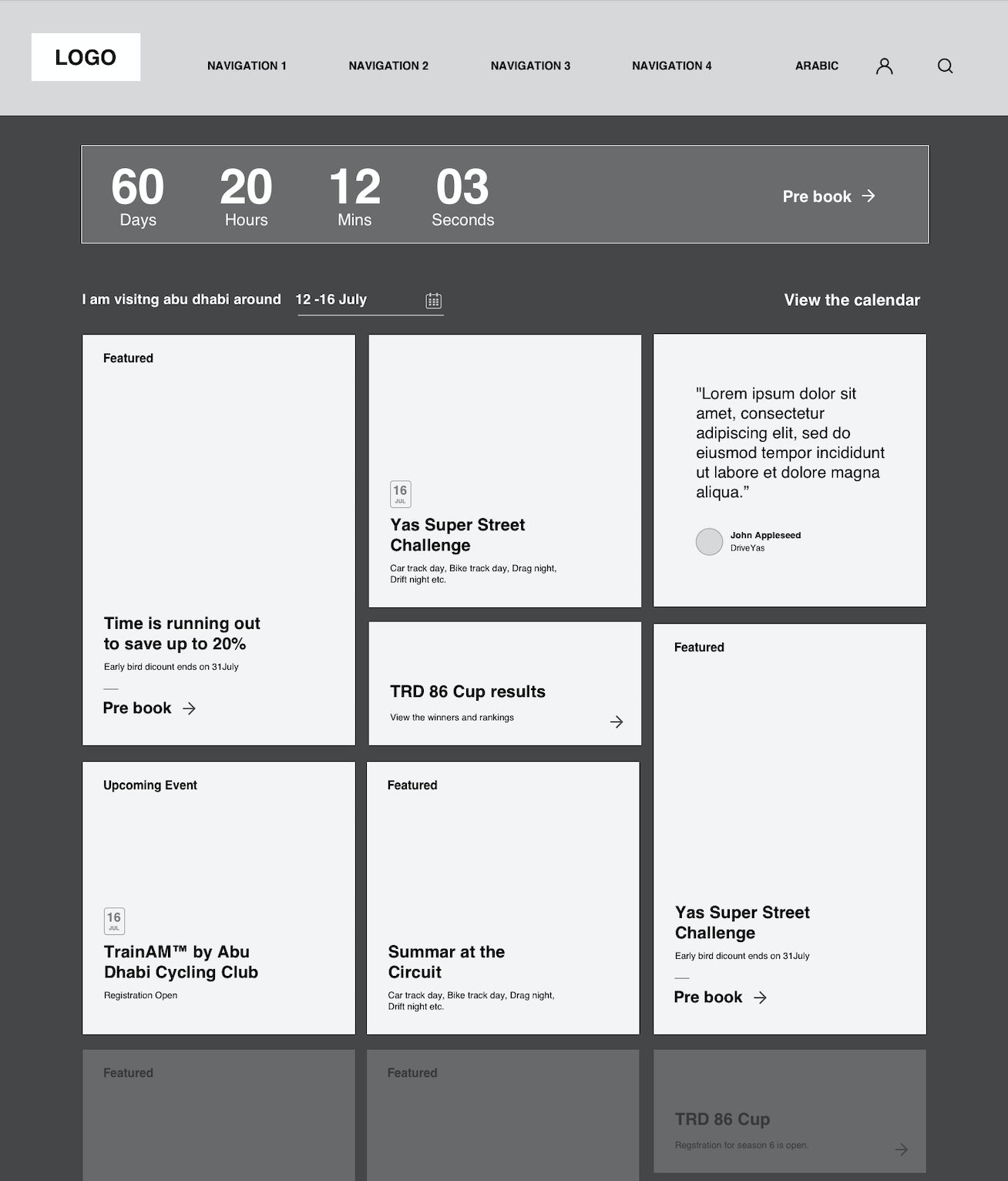
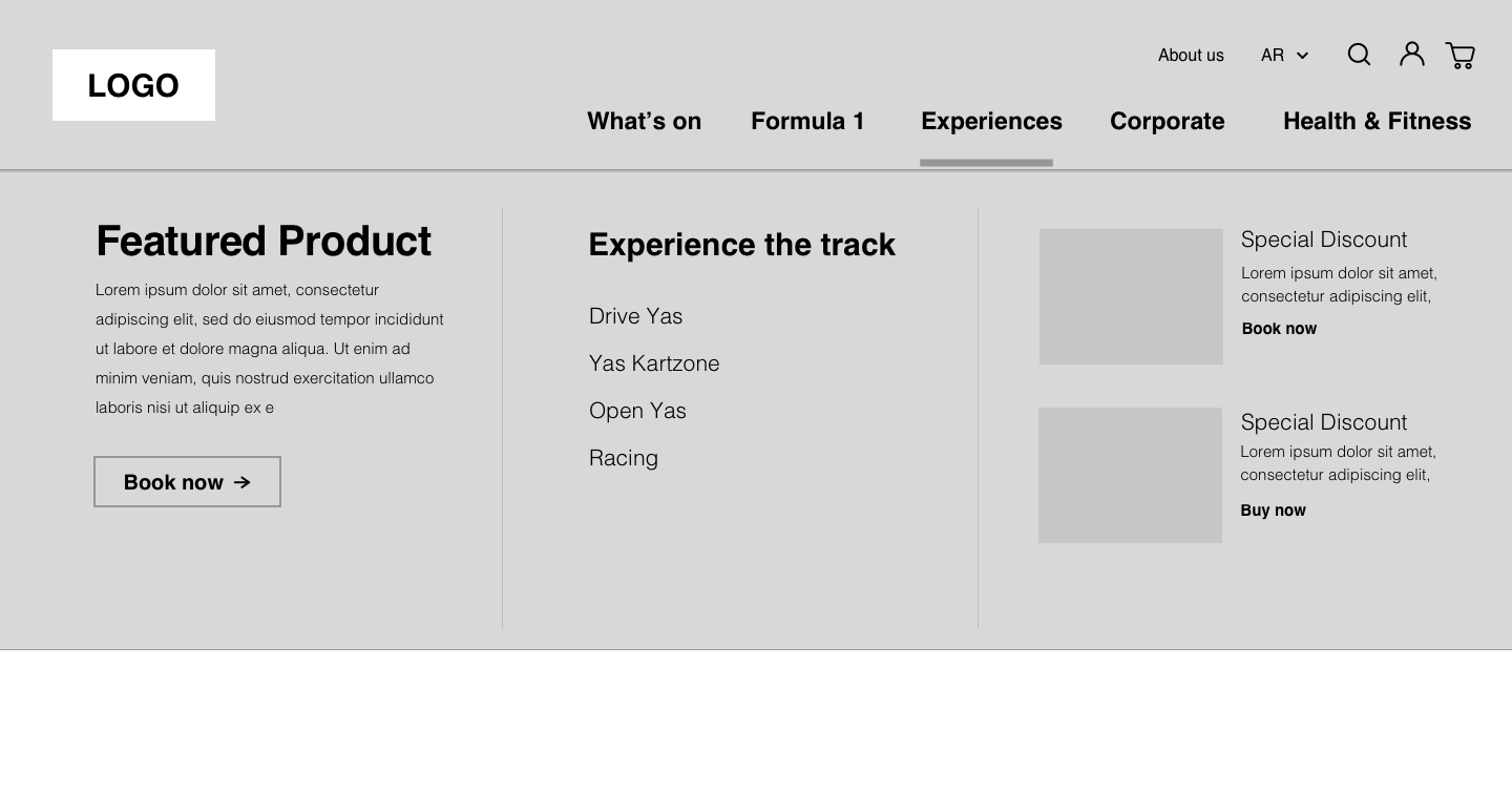
We decided the best way to organise the navigation was in the form of a megamenu with content boxes for featured content. The menu would be bucketed into YMC's main offerings: Corporate, Health and Fitness, F1/Abu Dhabi Grand Prix Event and Motorsport Experiences
Once we had set up the sitemap and wireframes for the new YMC website and mobile app, we looked at how to bring these to life by working closely with the client Creative Director. Considering a very rigid component library where we didn't have much control over what we could do, we had many discussions with the tech team on what was feasible and what wasn't in terms of the timeline and scope.
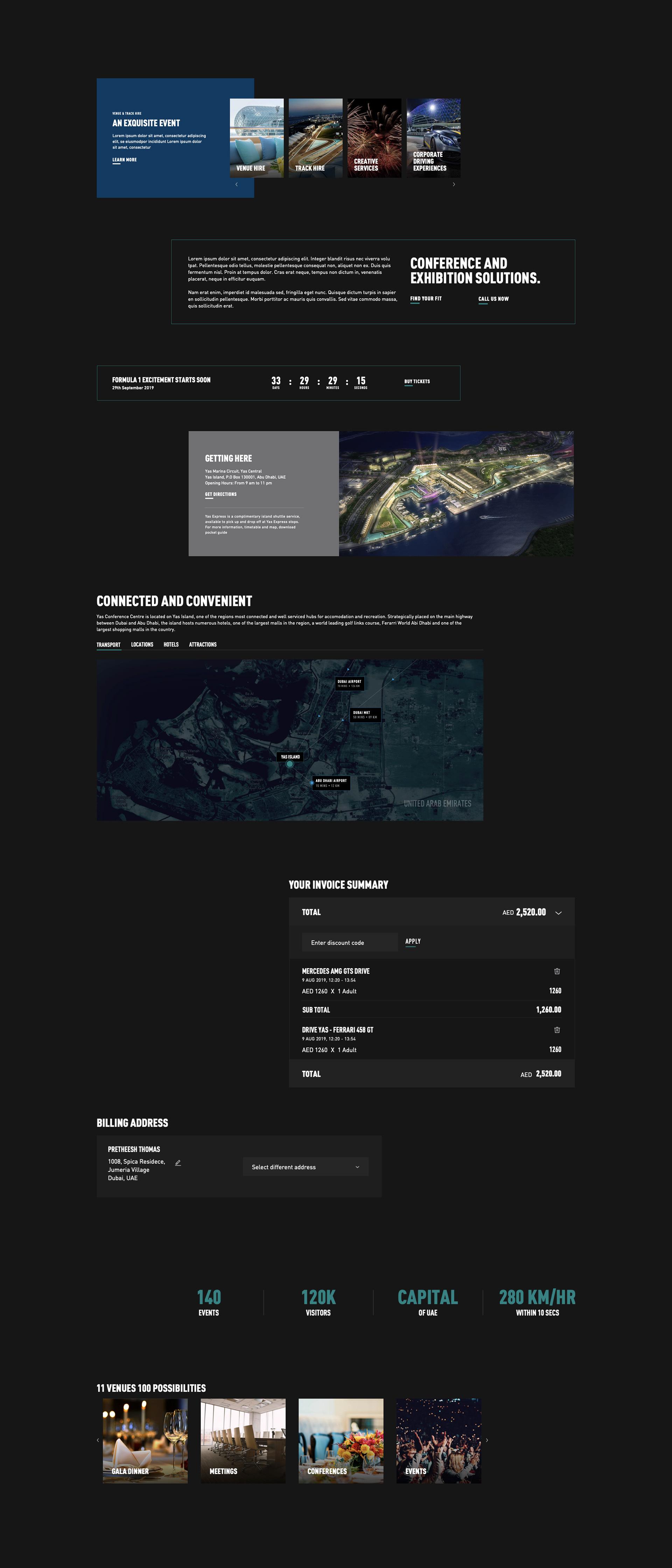
The original web experience had much room for improvement. We had the chance to add a bit of a personality to the site as well as design in way that suited the model of frequently-updated event-based content. We had endless discussions with the in-house team on what images to use where and why to avoid issues like black gradients on white backgrounds (See original website image)

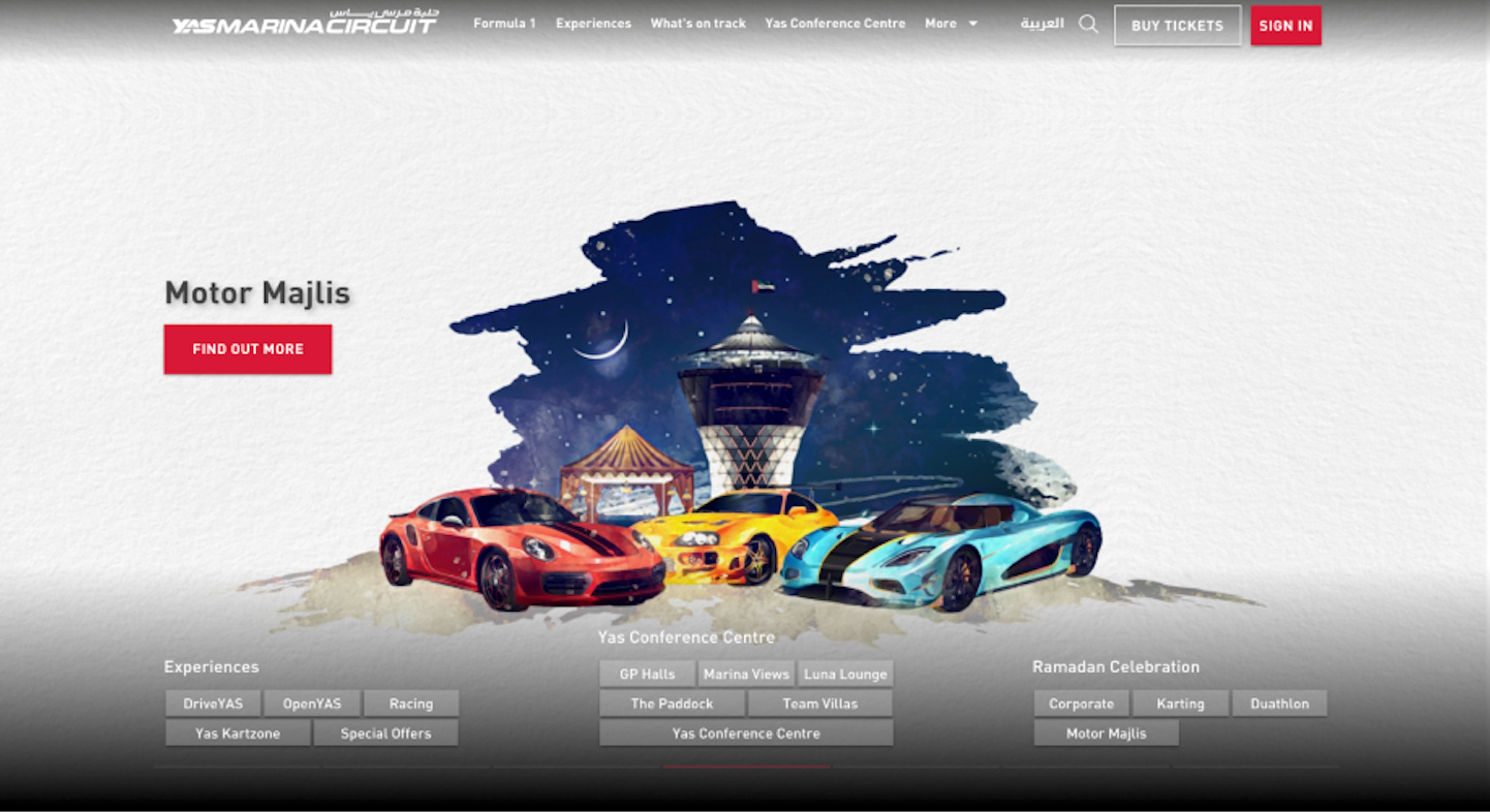
The new Yas Marina Circuit
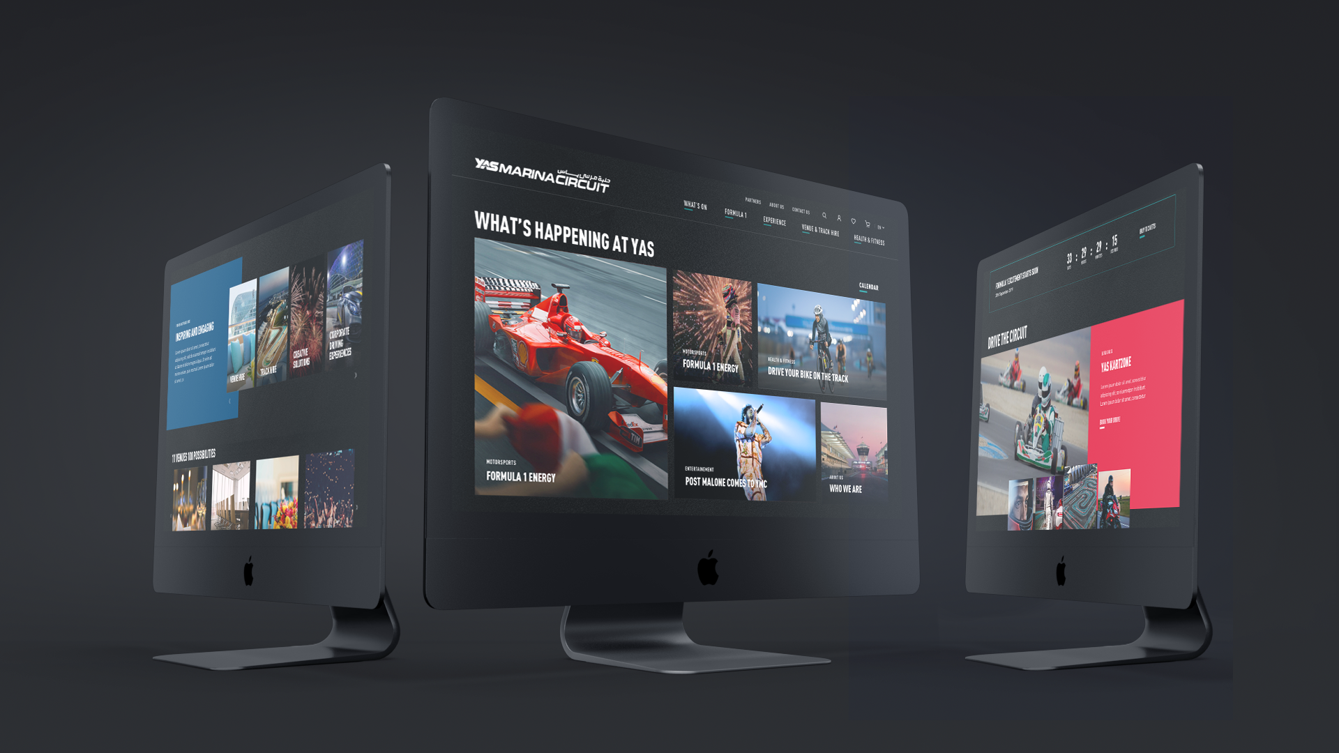
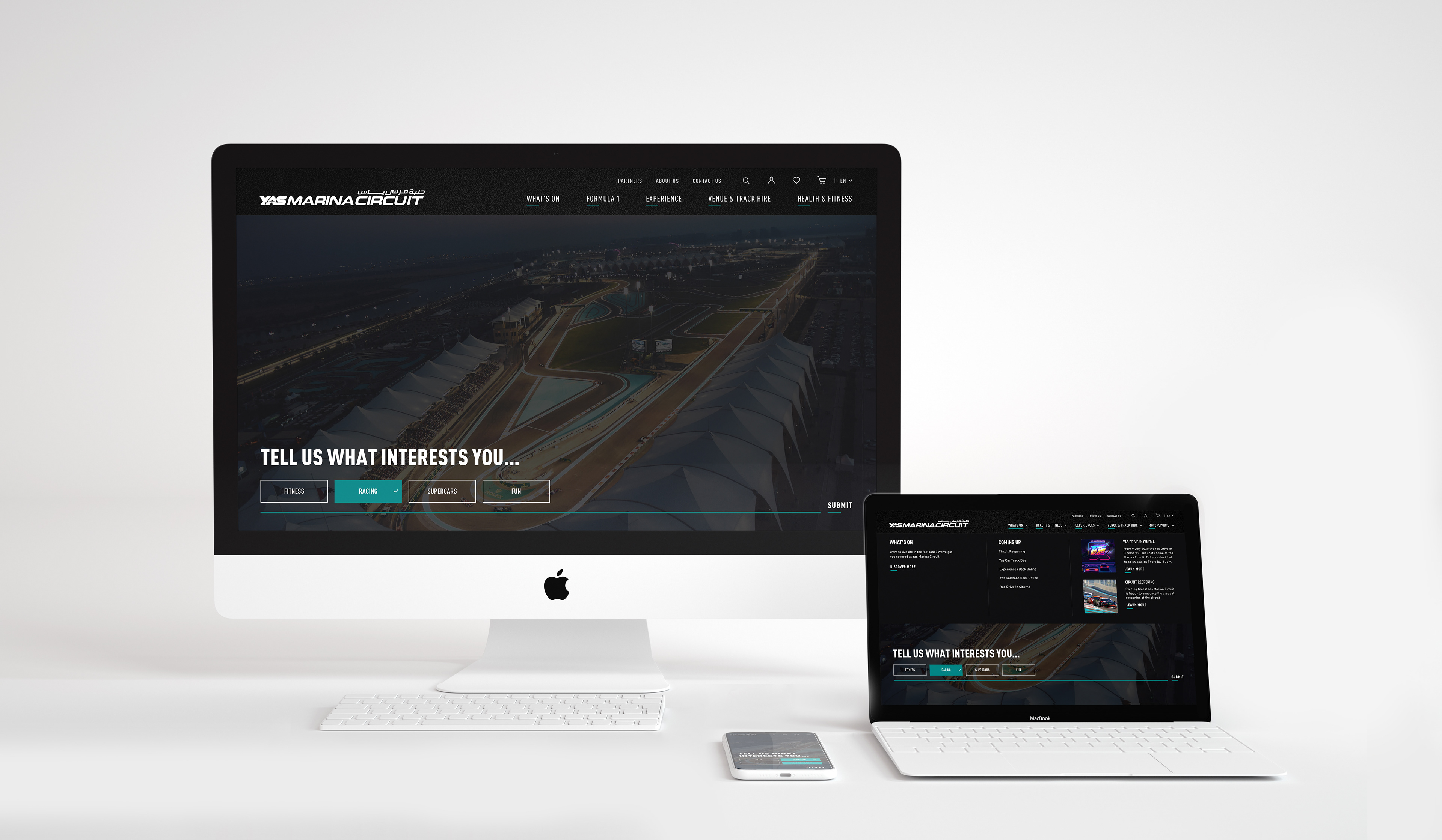
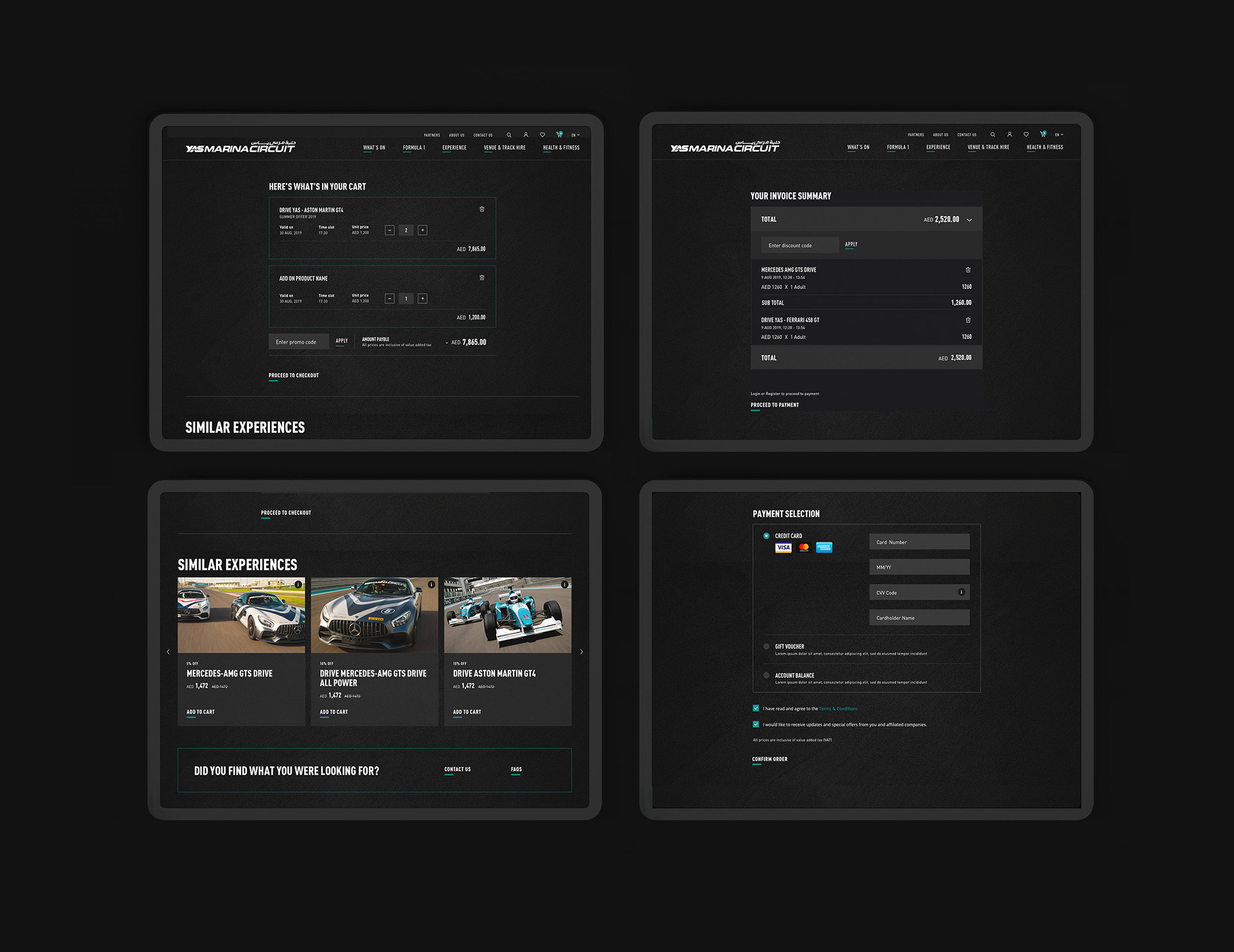
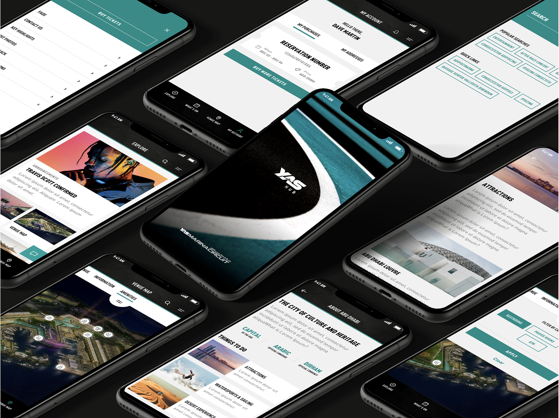
Dark UI
The ask from client was to position YMC as more of an entertainment content creation brand and during the research phase we found most users to engage with the website prior to arrival so for example at home or indoors. Paired with their ask of being a content-based brand this pointed us in the direction of Spotify and Netflix with a dark UI design.


Animation
Unfortunately there was no animation included in the scope but we managed to have some fun with the CTA Hover state. Small wins
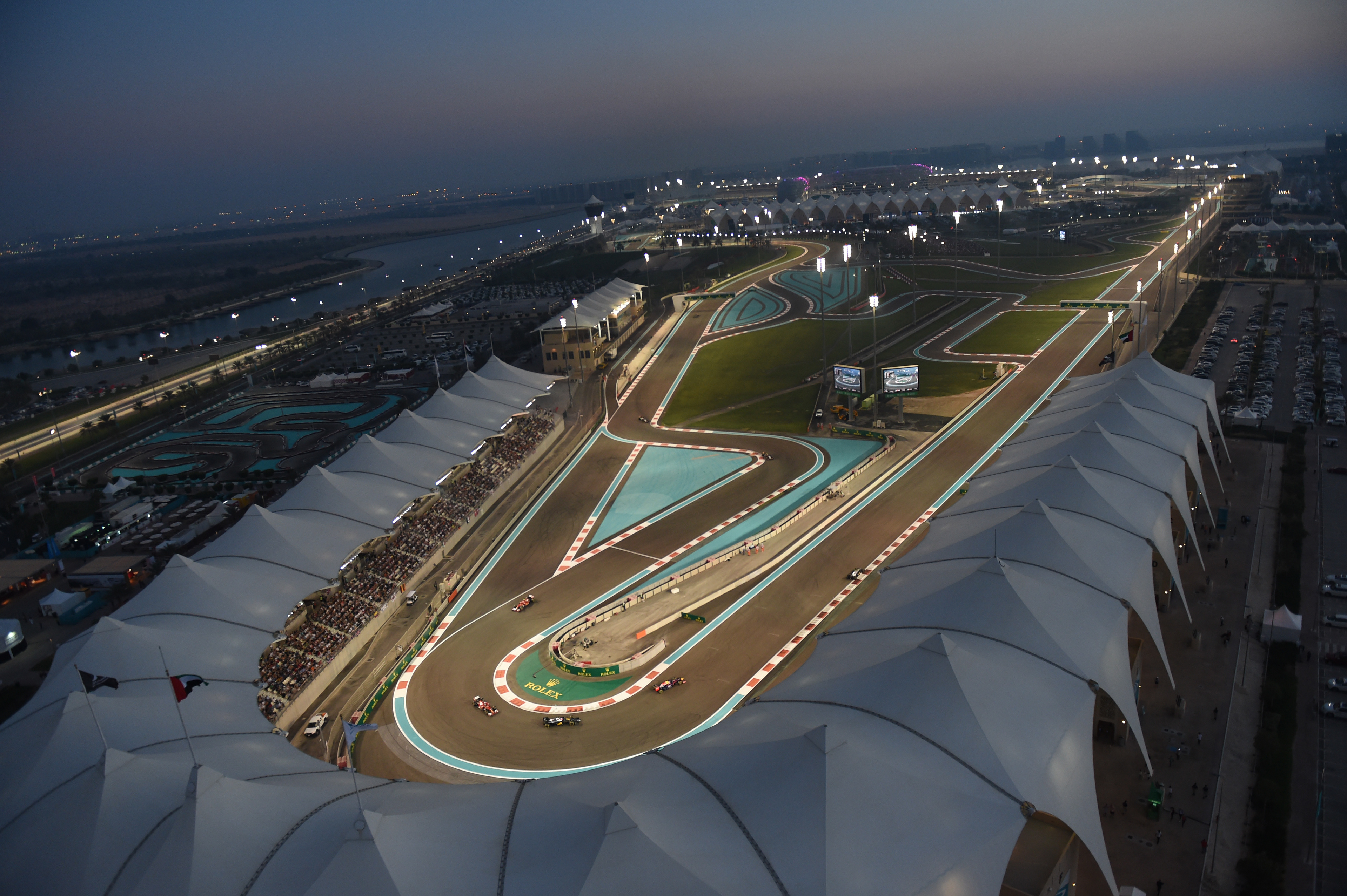
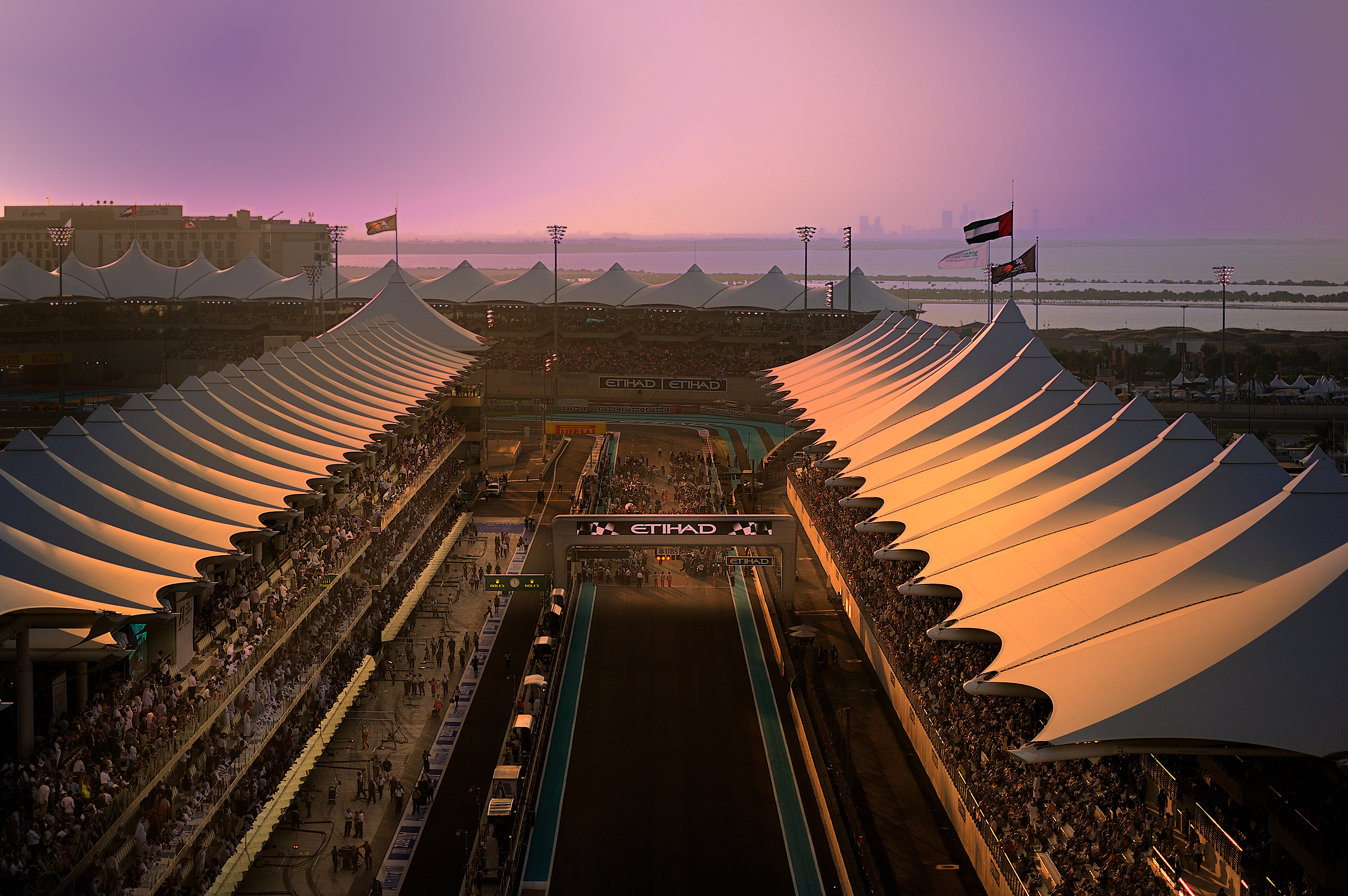
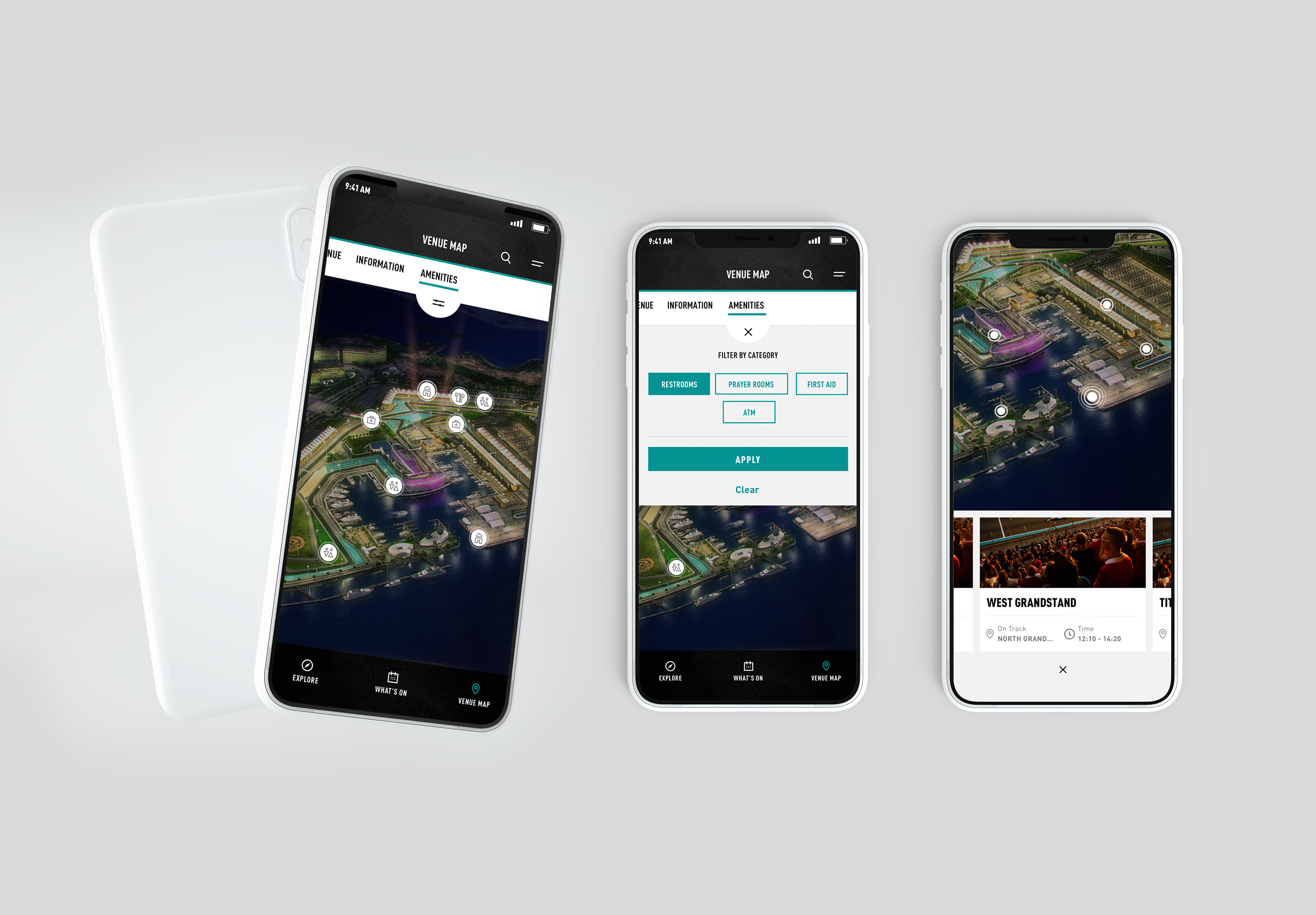
Because the track is such an important part of YMC and its offerings particularly in the motorsports and health and fitness sector we decided to bring this element to life on the website.
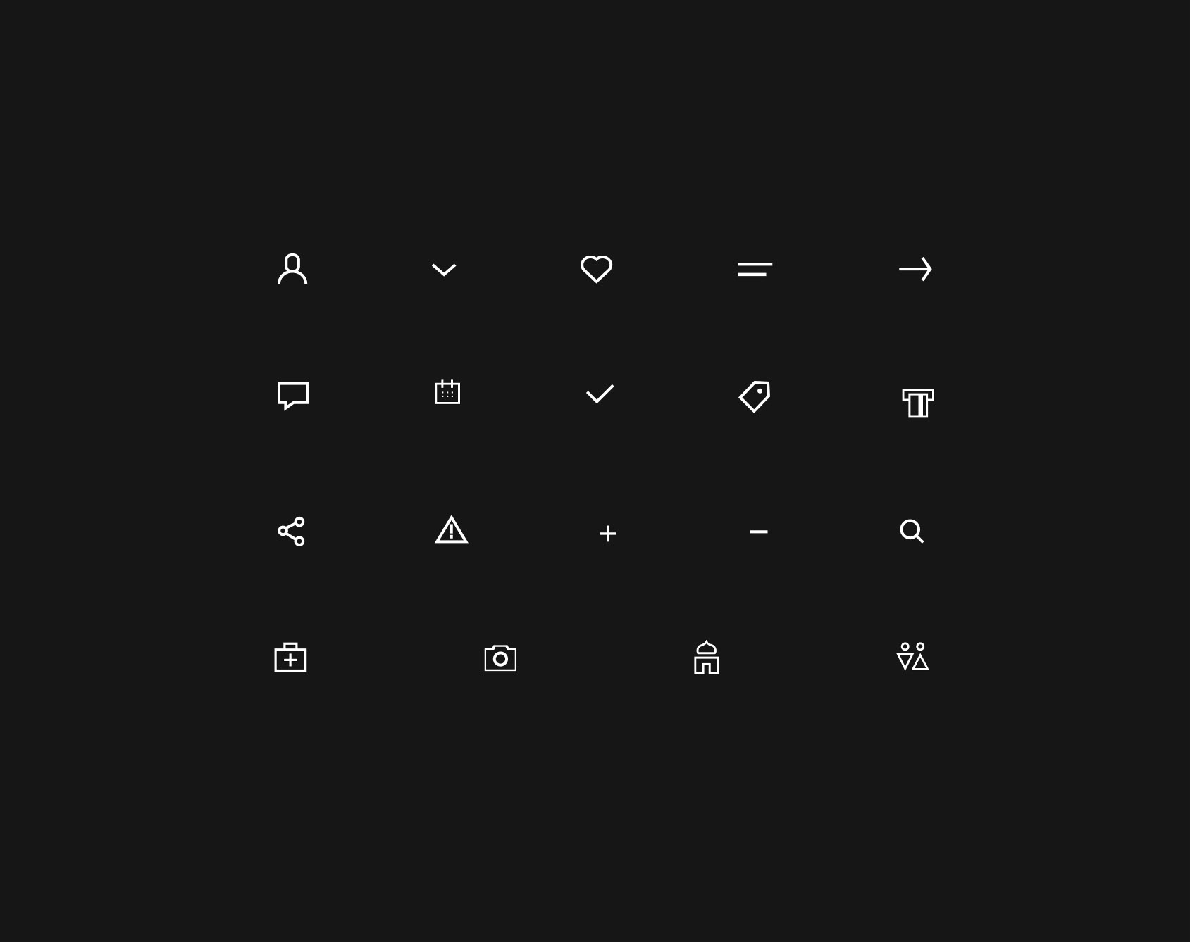
Components
This was the biggest challenge of all during the whole project - the lack of components suited to the brand and not much wiggle room to play with design. We really had to stick with what was done prior for other tenants even when the choice did not make sense. This project was a prefect example of working within an extremely limited scope and with limited design freedom.
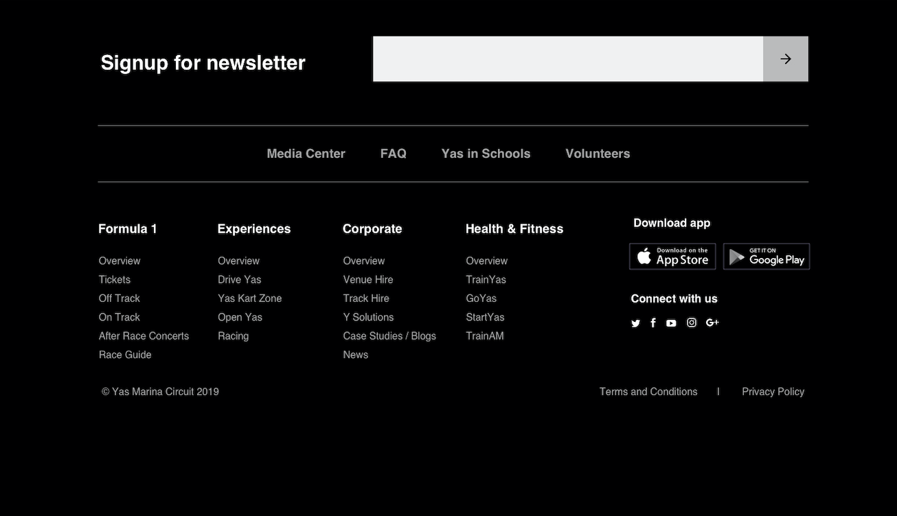
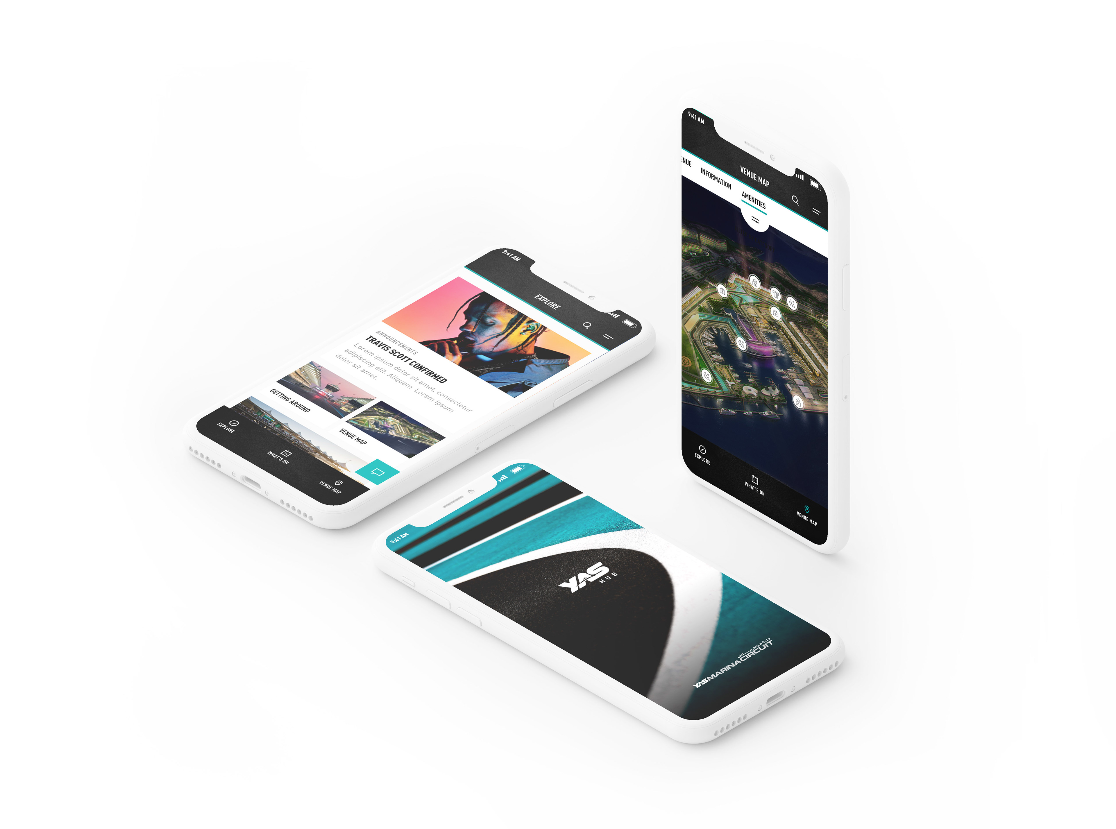
Mobile Application
We considered the contextual environment the user would be in when engaging with both the website and mobile application. We ended up using dark UI for the website as research showed the website was mainly used in the booking and planning stage prior to arrival. For the mobile app we designed in light mode as we knew the app would be predominantly used on-ground during events with features such as way-finding, storing tickets etc.
In conclusion
More a project in where we learnt what can one achieve with so many restrictions and how can we overcome these challenges.
Overall this project was extremely challenging as we had many restrictions from the scope, the platform as well as the timeline. More a project in where we learnt what can one achieve with so many restrictions and how can we overcome these challenges. This is however a constantly evolving platform and new releases are made every few months so over time it is something that becomes more and more flexible but for the scope of the first release and all its restrictions we managed to produce the best designs that provided the user with an enhanced user experience.
Things I learnt along the way
I mention this many times but the main thing I would say this project taught me is how to work within so limitations, be it platform, brand or team. I learnt how to work closely with the Dev to achieve a middle ground and to always keep the user at the heart of all our decisions.